 And what happens when you mis-spell it?
OK, picture the scene. The London Underground have produced a set of posters for their "Journey Planner" service. For some reason, the agency has a bit of a problem with spelling Southwark, no one at LU notices and they get printed.
So do they scrap all the posters cos it will look really stupid?
Or do they try to cover the typo with some text as they think no one will notice?
It appears to be the latter, except they didn't expect someone to notice and email Geoff to tell him or expect Geoff to email me and then for me to be all geeky and blog it.
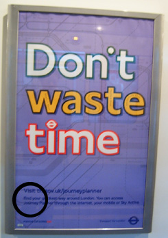
So here's the poster in question on the left, with where Southwark is, ringed.
If you zoom into the picture some more you'll see Southwark or rather Southwalk underneath some text:

If you look at what should be an "r" you'll see it has a bit of a curve to the bottom of it - implying that it's an "l". It becomes a little easier to see when you see how it should look and how the "l" in London Underground font works (see Waterloo):

There is no escape from the random geeky scrutiny of this blog.
No comments:
Post a Comment