collect all the different variations of tube maps that are floating around the internet.
I once spent a rather dull and rainy Sunday afternoon reversing the tube map and writing it all the names again using the correct font, so that Mill Hill East and High Barnet appeared at the bottom of the map, and Morden at the top. They're on all this page here.
Well today I discovered a brand new variation! I can't take credit for it, but I don't know where it came from either - perhaps if the author of it is reading this he could let us know?
Anyway, they've obviosuly spent a long time doing it, and it's what the tube map would look like if applied in a way where more of south London had tube stations instead of the north. Neat!
(Click on the image to see the rather large full version)
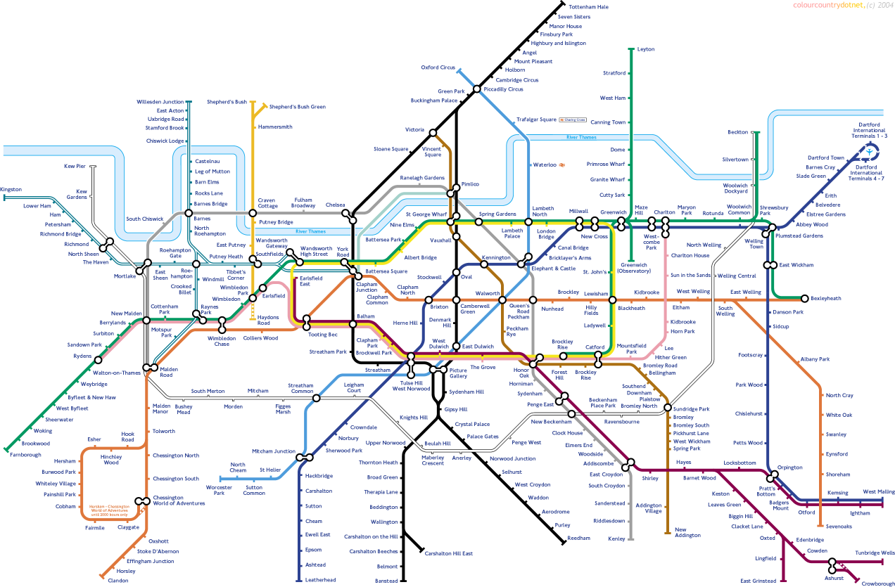
Updated - Its from Colour country's site!
No comments:
Post a Comment